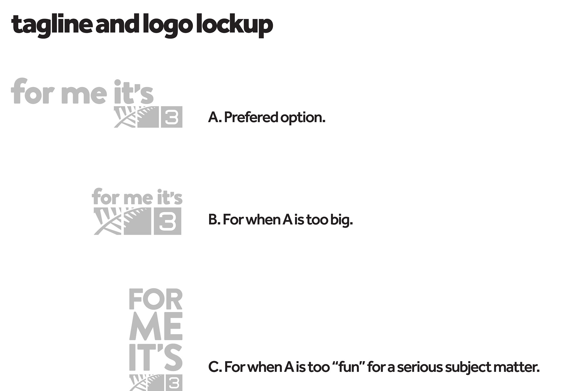
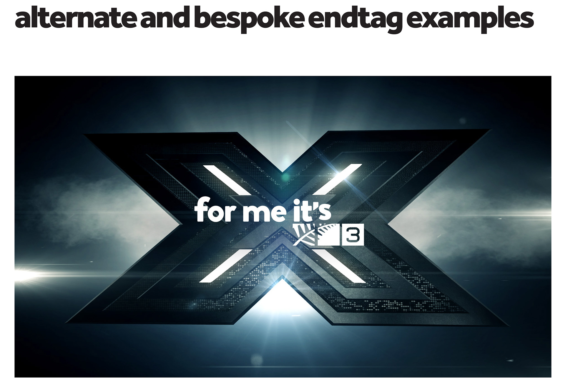
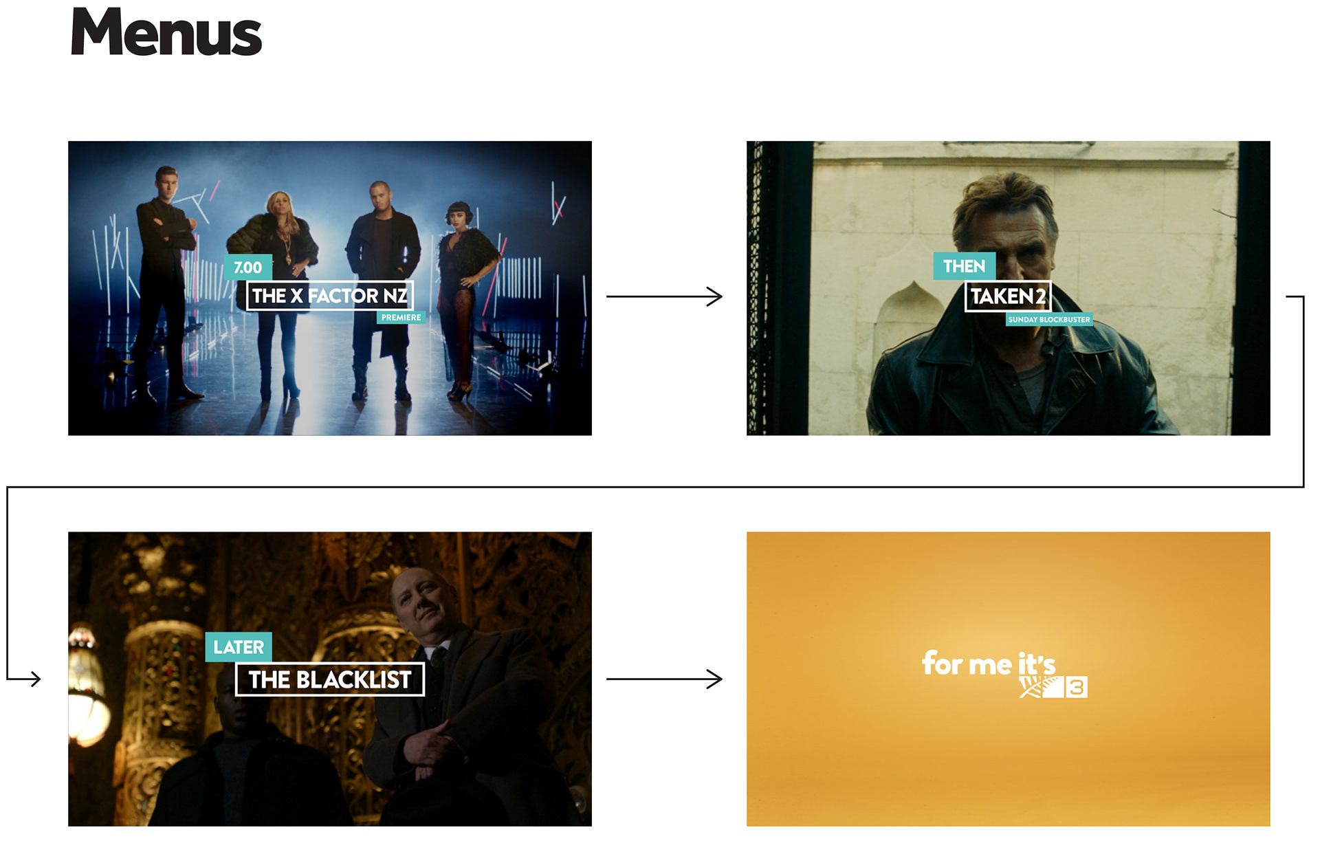
TV3 had originally been positioned as "No Place I'd Rather Be!". Moving the channel forward required enganging not only our on-air talent and presenters but also our "social network". The people who watched and engaged with TV3 and its broad content. "for me it's 3" was the evolution of the brand from a place of content to a place of and for the people. Our talent and social viewers became the ambassadors of the brand, sharing their unique stories and what they loved about TV3.
While there was much discussion around eveolving the existing TV3 logo, it was felt that the silver fern logo still held a large amount of value for the brand and while its shape and structure was less than complementary with the new more friendly engaging positioning, the task we had was to make it feel fresher, lighter, broader and more engaging.
Creative Director: Ant Farac
Graphic Designer: Andrew Bunyan